Beautiful basement built-ins.
The basement in our current home was fully finished when we moved in so although it was ready for living, we certainly didn't use it in that capacity. Instead, it became a dumping ground for all of our excess "stuff". When our little babies became mobile and their toys started to migrate all over the house, it was time to clean out all of our junk and set up the basement as our TV/entertainment/kids play zone.
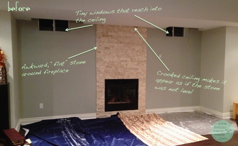
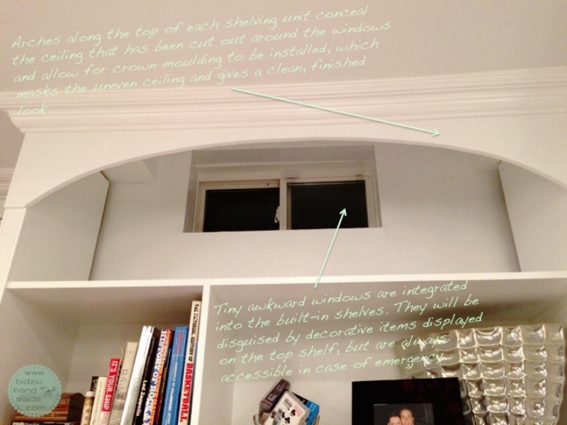
So, for our first project in the basement we decided to do large built-ins in a "nook" that housed the fireplace. What we were starting with was a pretty sorrowful situation; a fireplace flanked with beige stone and a couple of tiny windows that extended up past the ceiling line. The stone itself was installed right on the drywall making the whole thing look "flat". Furthermore, because the ceiling above the fireplace was uneven, it appeared as if the stone was installed without the use of a level. And the windows... they were tiny, located right up and extending into the ceiling, and I had no idea how to dress them up without accentuating their presence. I wished we could just rid of them entirely but, due to building code, they had to stay and be accessible at all times. After much brainstorming, we decided we would install wall-to-wall custom built-ins, which would solve the aforementioned issues; we would get rid of the stone and flank the fireplace with two large shelving units on either side. A modern mantel, simple in design, would frame the fireplace, while the television would hang above it. The shelves would be built around the windows, such that they would be accessible if needed, but would be disguised by decorative items displayed on the top shelf of each unit. The uneven ceiling above the fireplace would be masked by the addition of crown moulding across the top of the entire built-in unit.
The basement had been finished by the previous owners of the house. On first glance, everything looked alright, but as we got working down there, we quickly learned that it was not a very well done job. We had to deal with a lot of imperfections and the one thing that proved to be most challenging were really uneven and non-level walls and ceiling. It was very frustrating, but we did not get discouraged!
The first step was to remove the stone around the fireplace. We were happy to get rid of it for three reasons; first, the stone was attached right onto the drywall, making it just about flush with the walls. It lacked depth and thus looked very strange. Secondly, the ceiling was not level so the top rows of stone appeared to be "off" by a whopping 1.5"! Thirdly, although it wasn't the ugliest stone we've ever seen, it wasn't to our taste and it did not fit in with our taste or decor in our home.
DIY built-in shelving unit, DIY built-ins, DIY built-ins around fireplace, DIY fireplace facelift, DIY basement reno, DIY basement project, DIY fireplace reno, build your own shelving unit, DIY custom made built in shelves, DIY custom built-ins, custom built-ins, DIY crown moulding installation, build your own shelves, fireplace facelift, fireplace renovation, bidziu handmade, bidziu hand made
Once all the stone was removed, that portion of the damaged drywall was cut out and for fire safety purposes, cement board was installed in its place. Because the area above the fireplace did not have any 2x4s (just metal brackets), we added a sheet of 5/8" thick plywood on top of the cement board, which would allow us to easily install our television above the fireplace. Eric also added an electrical outlet in this area so that the television and sound bar could be plugged in.
We did not like the windows in this basement at all; due to their small size and awkward position partially in the ceiling, I thought they were an eye sore. However, because of building code, these windows could not be covered up permanently, so we designed the shelving units such that they would conceal the windows, while still providing access to them in case of emergency. These shelving units were built out of MDF. Once assembled, the interior and front surfaces were primed and painted in white in a semi-gloss finish.
The next step was to install the shelves into place. The plan was to install them right up against the wall, however, when we pushed them into place, we learned that the walls were very uneven vertically, resulting in major gaps in between the back of the shelves and the wall near the ceiling. To solve this problem, we attached 1/8" thick backing to the bookshelves all along the back side. However, because the access to the windows could not be blocked, the backing was not added above the very top shelf. In this case, the gap between wall and shelf could not be hidden. It would, however, be covered up with decorative items I planned on displaying on the shelf. To hide the gaps on the outer sides of the shelving units (on the sides facing the fireplace), thin, L-shaped pieces of aluminum siding were attached to the corners using PL adhesive. Once adhered in place, the aluminum was primed and painted semi-gloss white. To disguise the openings in the ceiling around the windows, two arches were cut from MDF and attached to the fronts of each shelf unit right along the ceiling.
Once the shelving units were securely in place and the "gap" problem was resolved, we proceeded to build a mantel around the fireplace. We really liked the ultra modern fireplace mantel we had previously done around the fireplace in our living room, so we repeated that idea down here. We played around with various trim details, but in the end we wanted to keep the lines straight, simple, and modern. Once the mantel was in place, we finished the wall above it with faux shiplap. For the shiplap we simply used 1x3" lumber. Finally, I touched up imperfections with paintable caulking, primed, and painted in semi-gloss white.
For a finished, integrated look, the entire built-in unit was framed in with baseboards and crown moulding, which proved to be our biggest challenge yet! This was our first time ever doing crown moulding (on an angle in corners), so not only did we have to wrap our brains around cutting the correct angles in the proper orientation (all those who have tackled DIY crown moulding know what I'm talking about, right? It's a brain teaser, that's for sure!), we had to deal with the crooked walls and ceiling! We pretty much had to forget any trigonometry we've ever learned and cut all types of odd angles to make the trim fit the uneven walls and ceiling as best as possible. Needless to say, we felt the guy that invented caulking deserved a Nobel prize for his invention! Although it was a challenge obtaining perfect joints, the caulking did wonders at filling in all the gaps and spaces. After one last coat of paint across the entire built-in unit, all the imperfections are pretty much only visible to Eric and I.
At last, we had arrived at the last step of this project! It was time to install the tile surround within the fireplace mantel. We selected a hexagonal mosaic tile in a white/barely grey colour with a polished finish.
Supplies for installing the tile surrounding the fireplace insert; hexagonal mosaic tile, a small tub of premium mortar, and trowels in various sizes.
Once the mosaic tile was in place, the next step was to grout the tile. After much deliberation between gray or white grout, we decided on the latter. We really love this tile but grouting it was a daunting task, to say the least! Because each tile has a raised profile, I couldn't use the traditional grouting method in which a trowel is used to spread the grout across the tiled surface. Instead, I used my finger to press the grout into each and every grout line between the tiles. One. At. A. Time. Ah! I know! It took forever! Especially since I was eager to get these built-ins done and it seemed like the most tedious part of this project was this very last step! Luckily, it wasn't a very large area. I certainly would not have selected this tile if it was for a backsplash or a shower (but how stunning would THAT tile look though!).
Finally, for a neat, finished look, we cut aluminum trim to size, spray painted it in flat black, and adhered it over the raw tiled edge around the fireplace insert. A piece of wood trim, stained to match the hardwood floors, was installed along the floor to conceal a small gap between the tile and floor.
...and PHEW! We were DONE!
Although we met some unsuspected challenges along the way, this project went rather smoothly and quickly (big thank you to my dad who lent a helping hand and my mom for babysitting!). We are thrilled with the final result!
Not only do these built-ins solve the issue of the "flat", crooked fireplace and awkward, tiny windows, but they serve as a grand focal point in the open area of the basement, are an interesting architectural feature, and provide a lot of storage space too! They really create a warm atmosphere and we all love to go down there to watch television on a lazy afternoon, or just to play with the kids.


